Solstice Case Study
From naming systems to visual languages, I build brands that mean something. Every mark, palette, and typeface is a decision — not a decoration.
One brand, four audiences, and a very low tolerance for off-brand PowerPoints.

Overview:
For seven years, I led creative at Solstice, a dental and vision benefits company within UnitedHealthcare. I owned the brand across brokers, members, providers, and HR teams, and in 2021 I hired and began managing a designer to grow the team.
Snapshot
Role: Senior Designer (2021 to 2026), Brand Identity Designer (2019 to 2021) | Scope: brand identity and governance, campaigns, UX/UI, presentations, motion, email, copywriting | Partners: marketing, sales, client services, legal, underwriting, and RFP proposals
The Challenge
Solstice was growing into new markets and product lines faster than its brand could keep up. Four audiences needed four different conversations, and every new deliverable was another chance for the brand to drift.
The Approach
A brand that holds up. Led a full company rebrand and wrote the 35-page Corporate Brand Identity Guide, then backed it with a Figma component library so the rules lived in the tools, not just a PDF.
Systems for everyone else. Built a SharePoint asset library, template sets, and quarterly brand newsletters so sales and client services could find approved materials on their own.
Campaigns with range. Concepted and produced campaigns for every audience: direct mail, paid social, display, landing pages, hand-coded HTML email, and video from 30-second spots to 4-minute explainers.
Digital that reduces friction. Led UX/UI for the MySolstice mobile app from discovery to high-fidelity prototype, and designed the Phoenix Union onboarding microsite that cut support questions from anxious new members.
The Results:
6+ portal launches for state, county, school district, and union clients | RFP finalist decks that helped win new accounts | One brand guide, 50+ templates, zero excuses for going off brand.
Curated Gallery
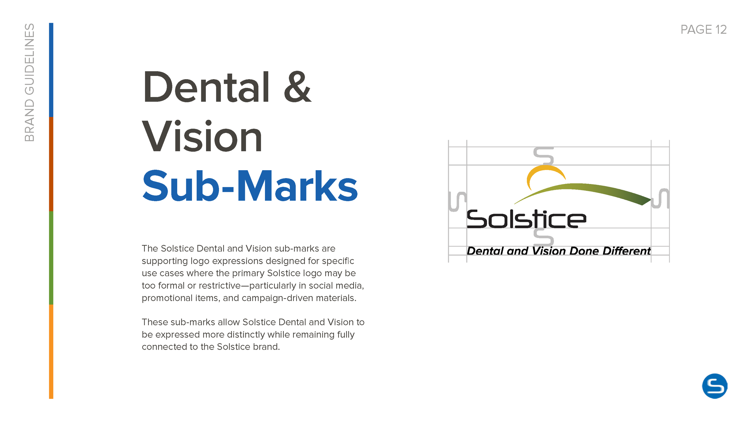
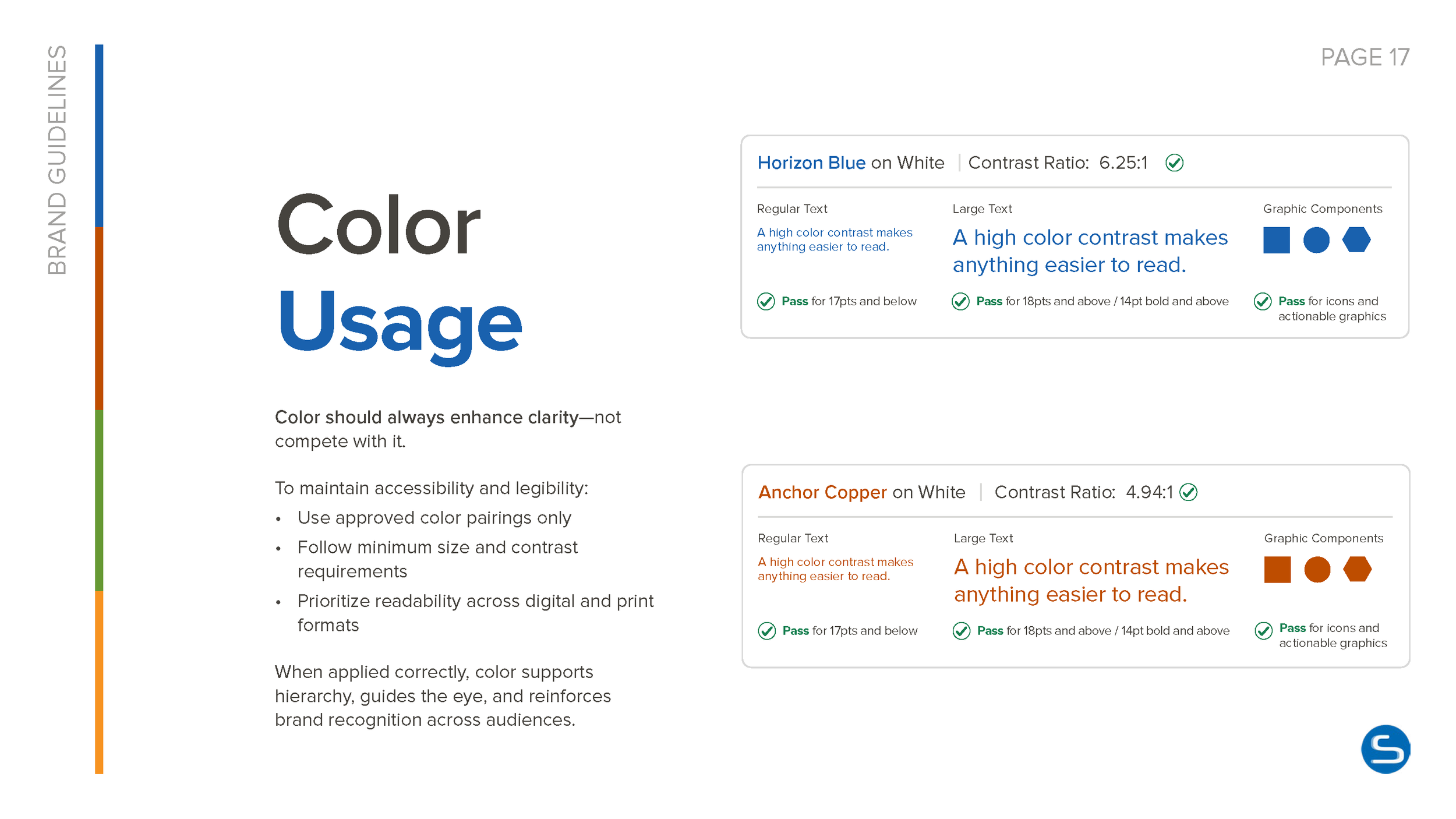
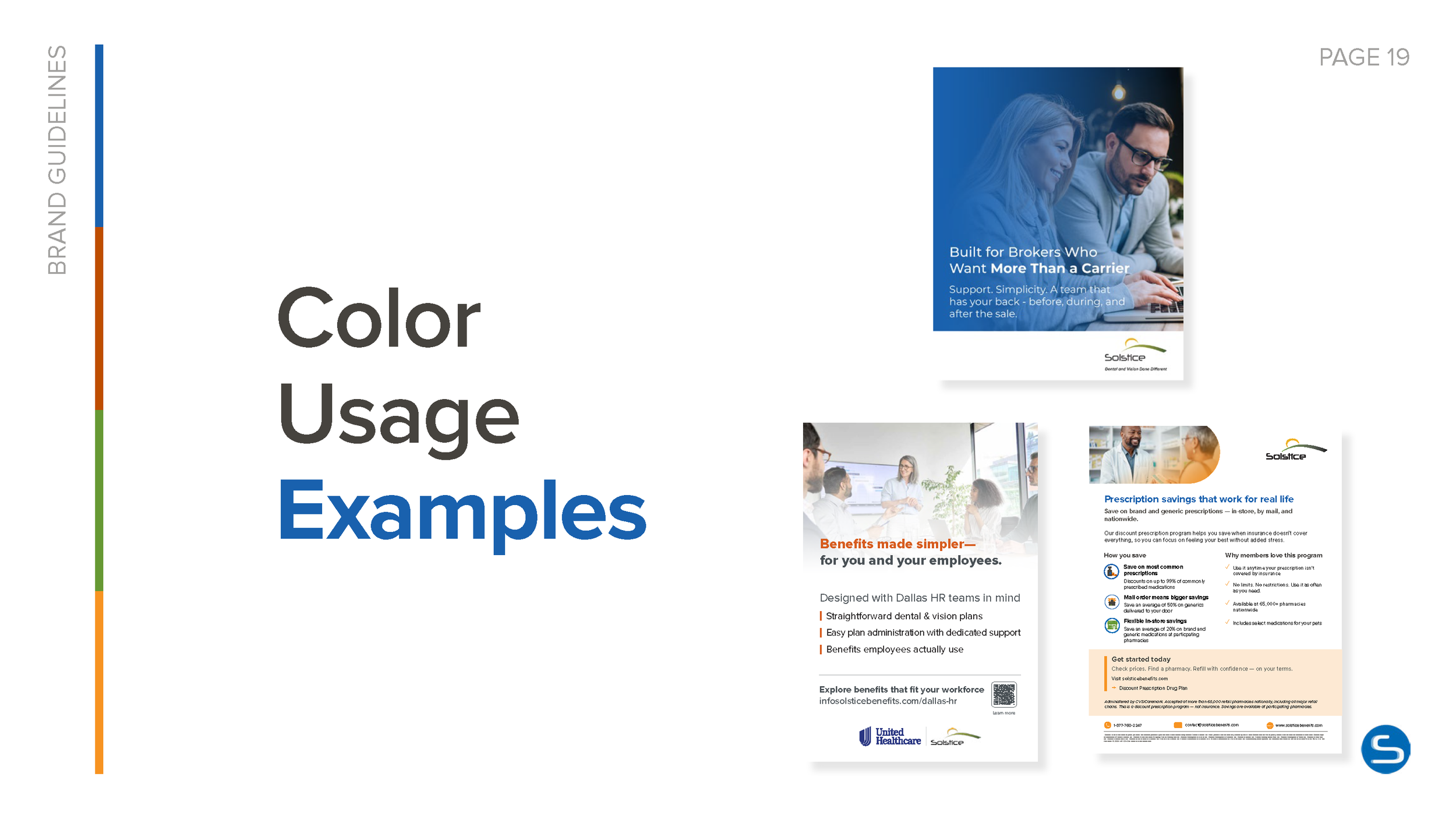
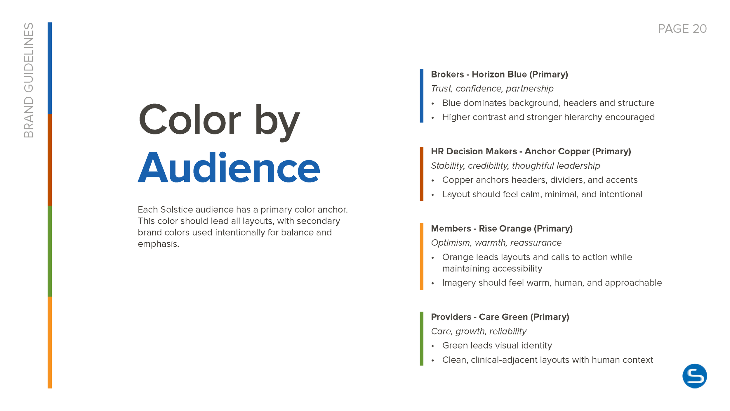
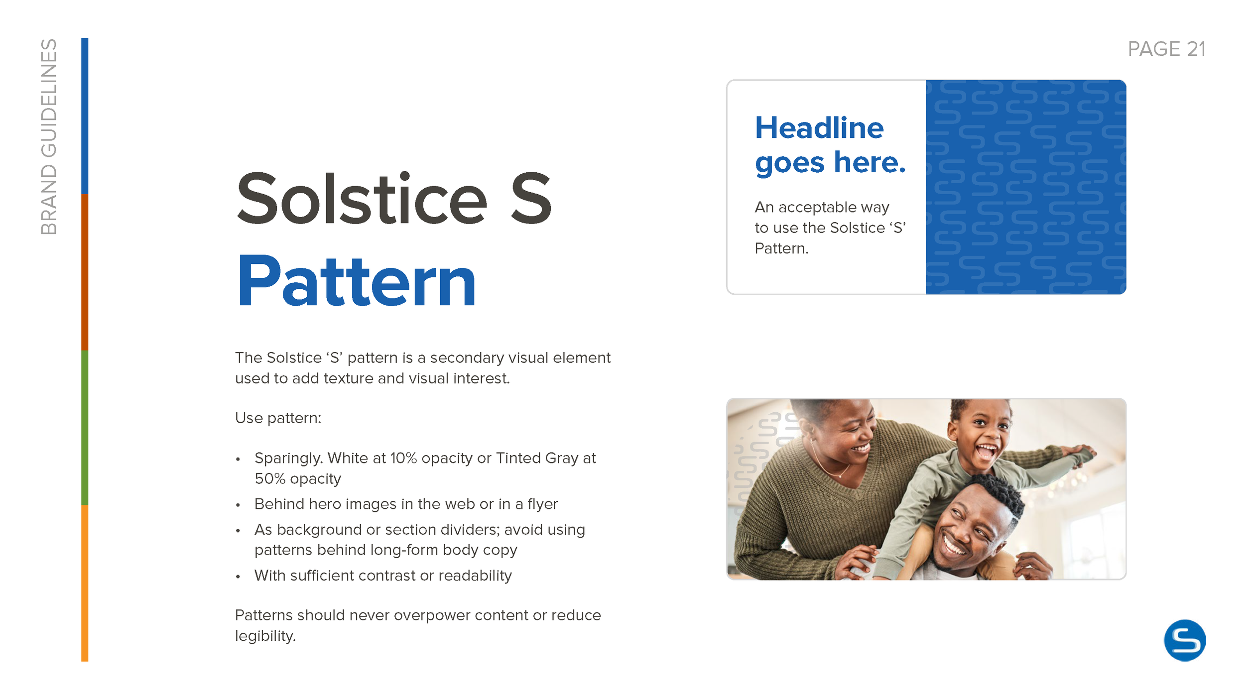
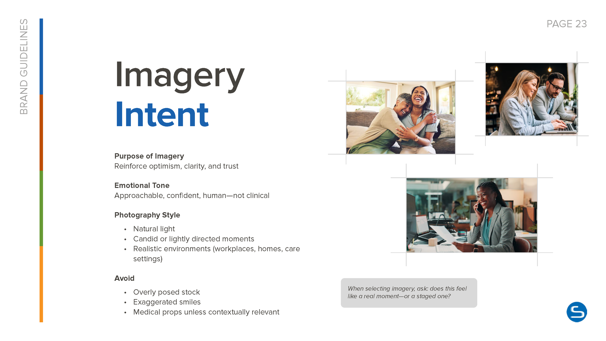
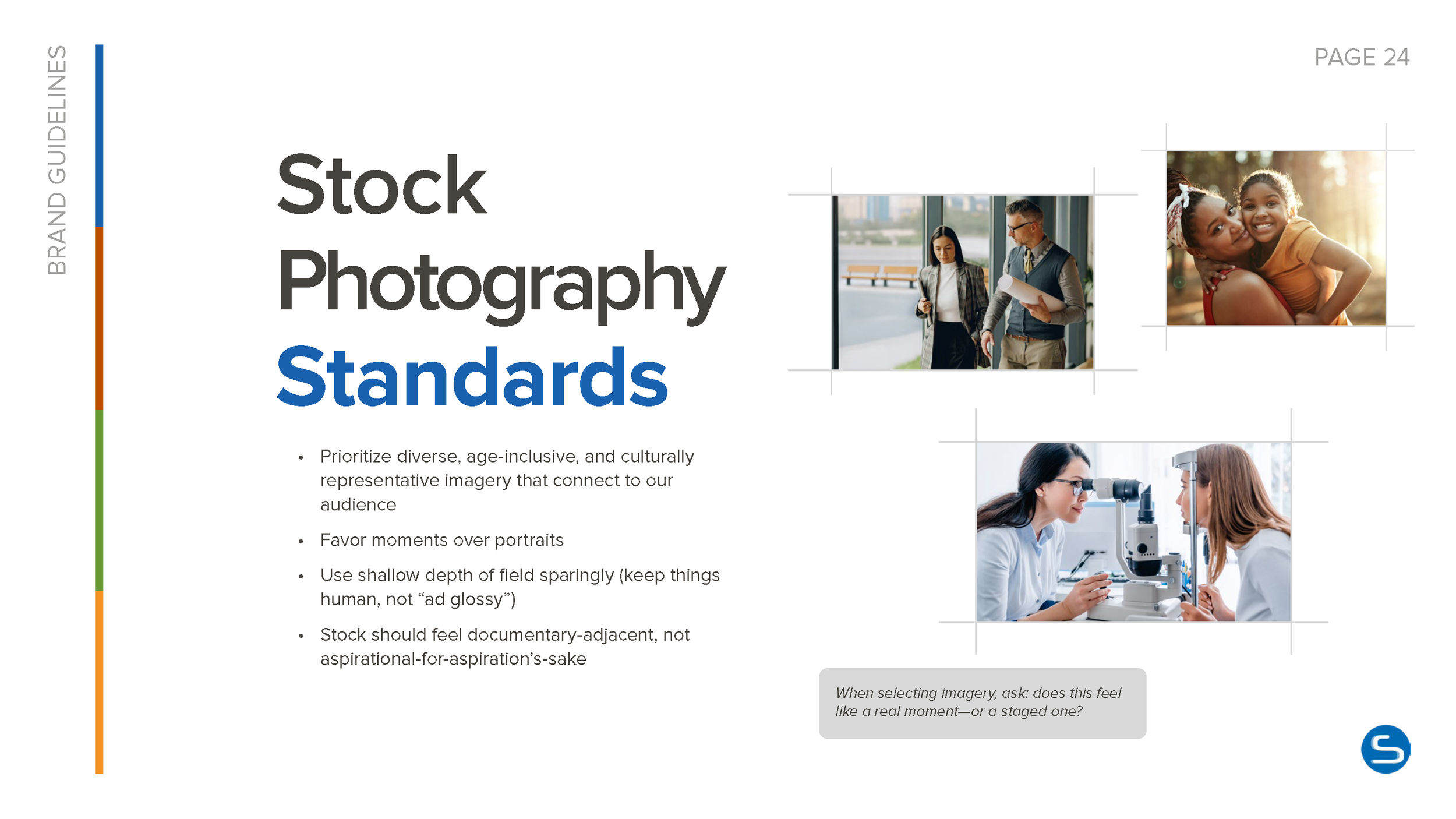
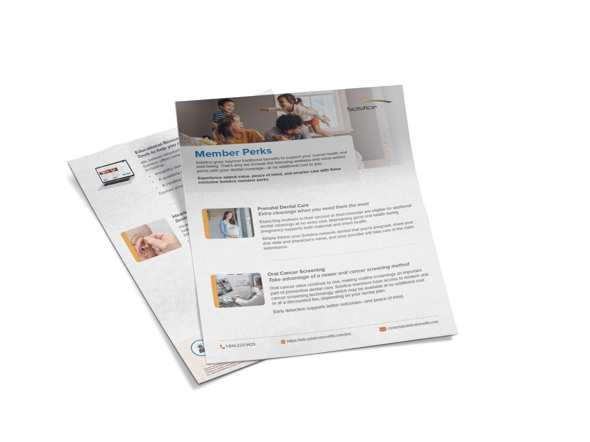
Solstice Corporate Brand Identity Guide
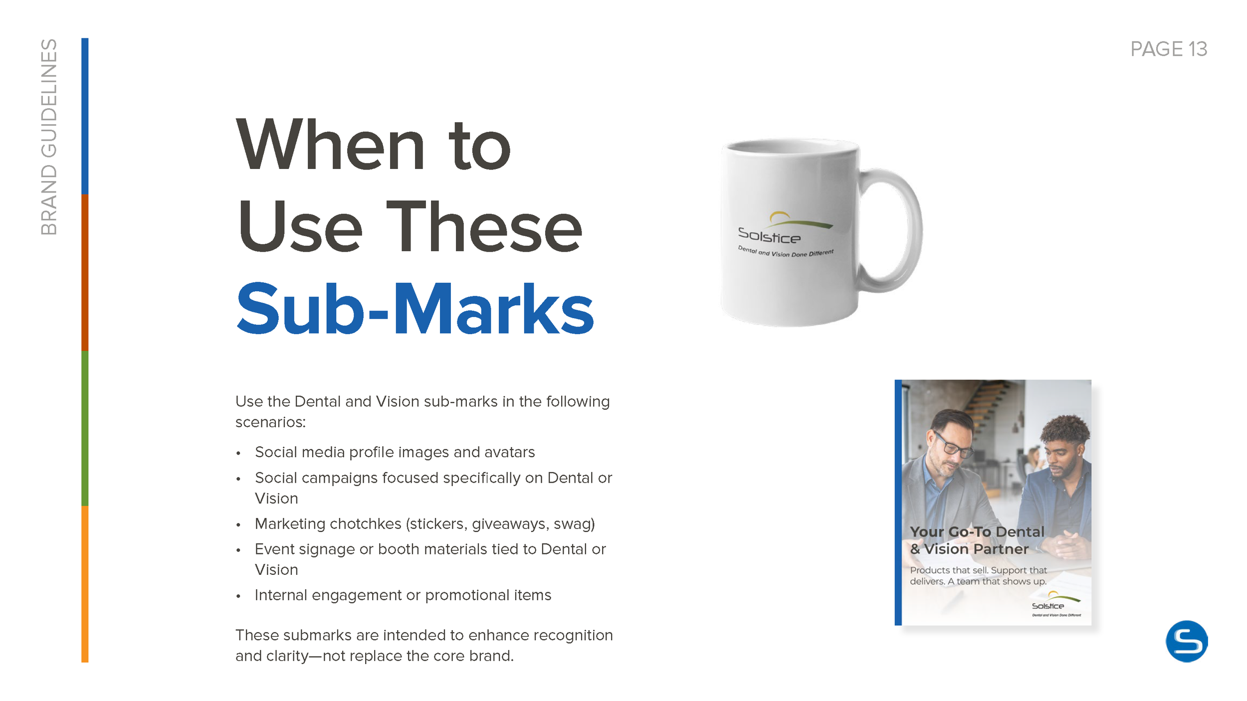
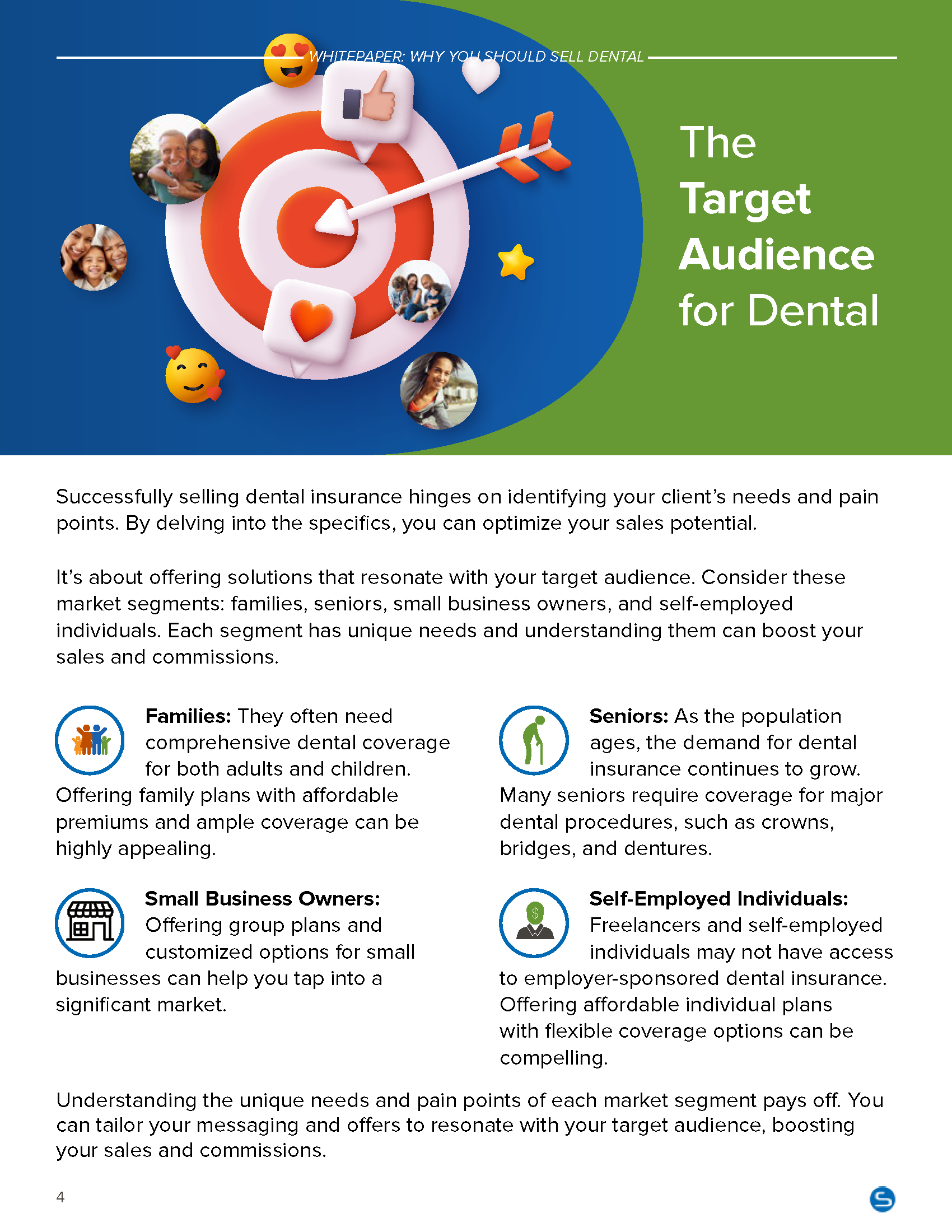
Broker Whitepaper - Why Selling Dental is Essential for a Broker’s Book of Business




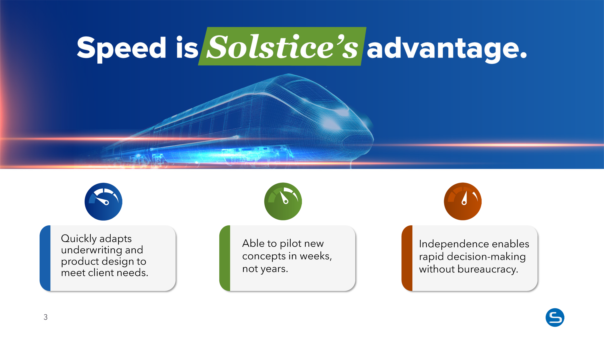
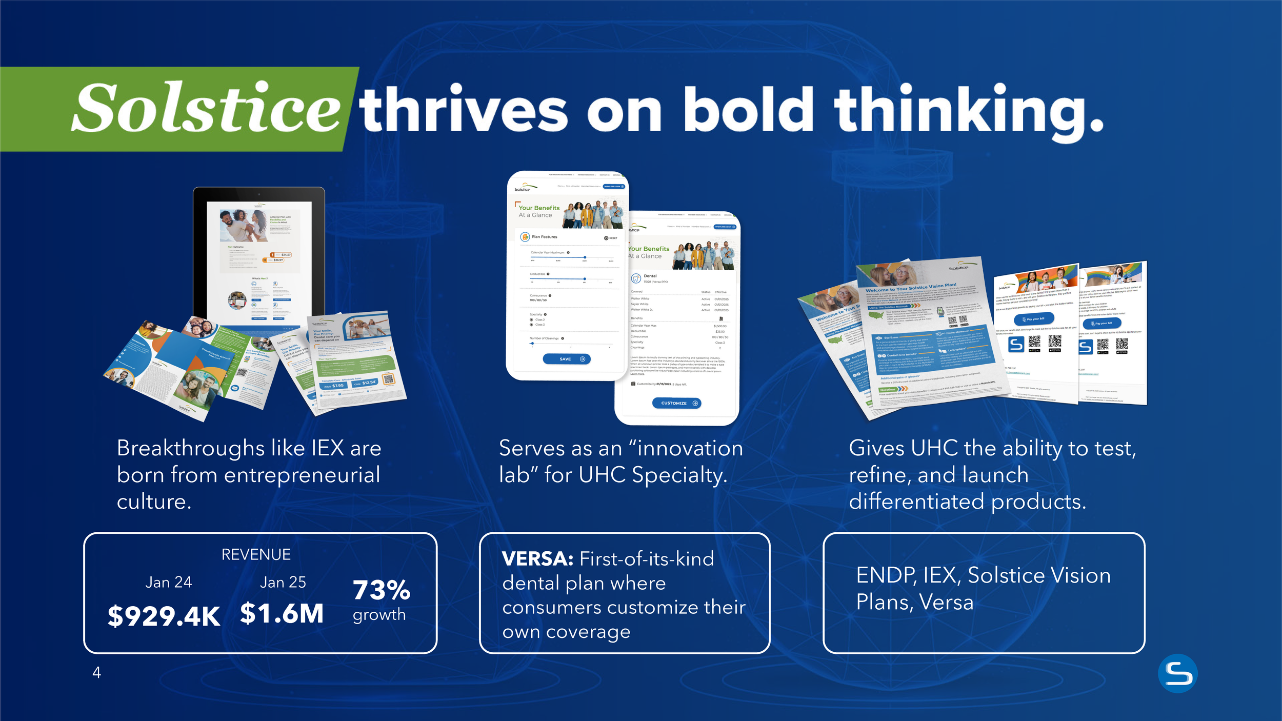
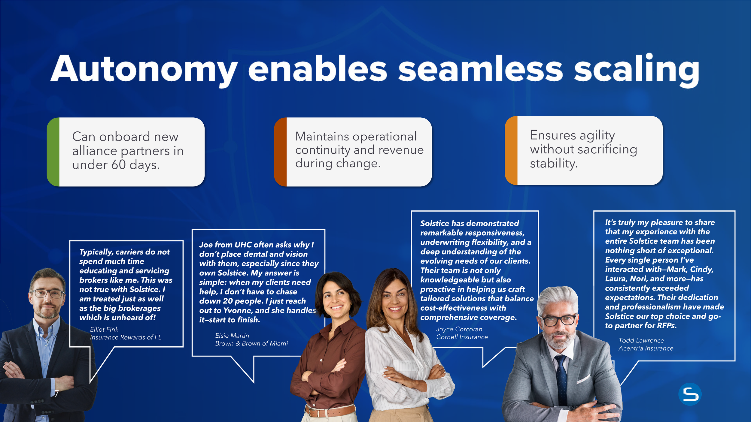
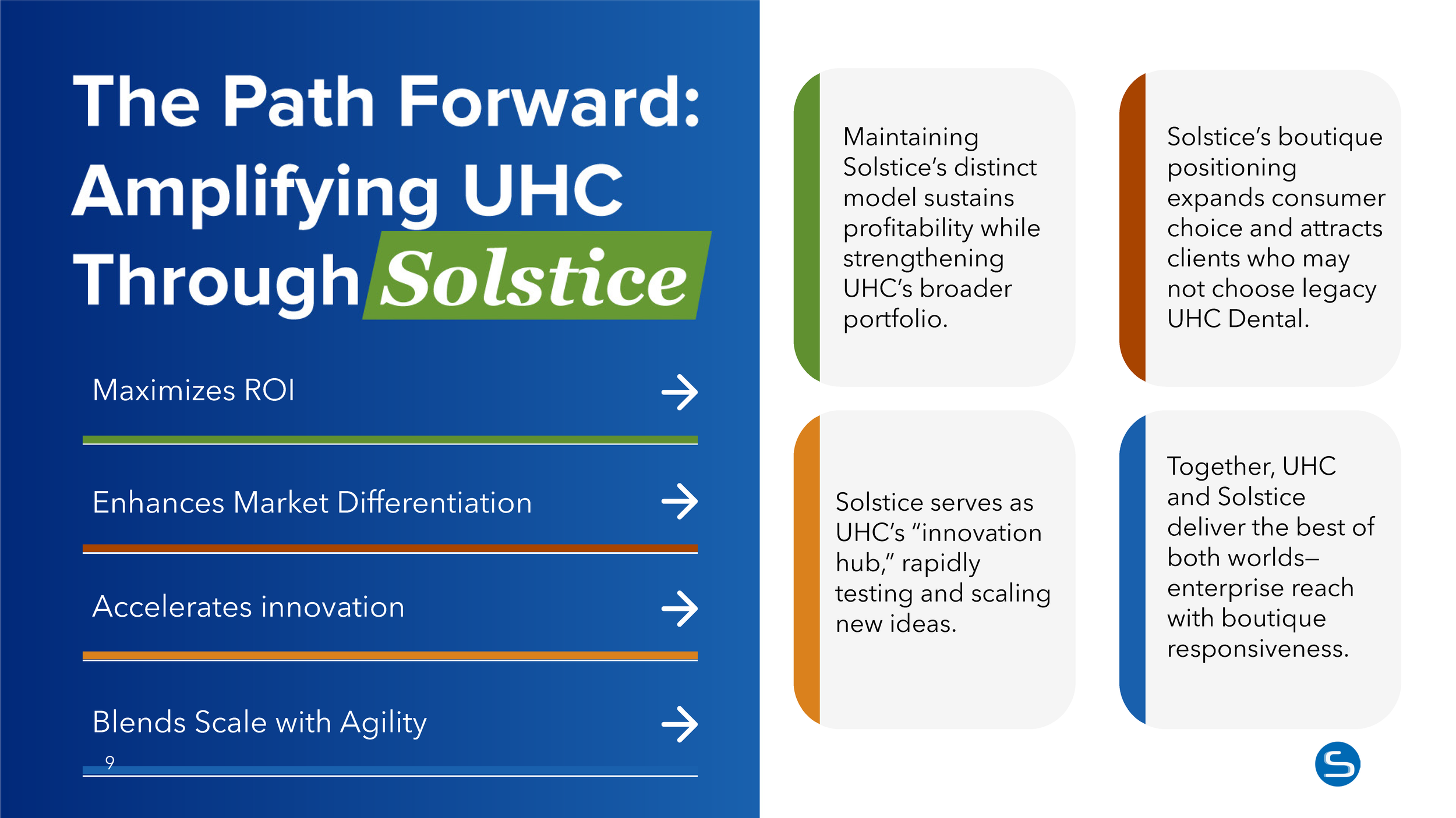
Presentation Deck for Dental Leadership Team
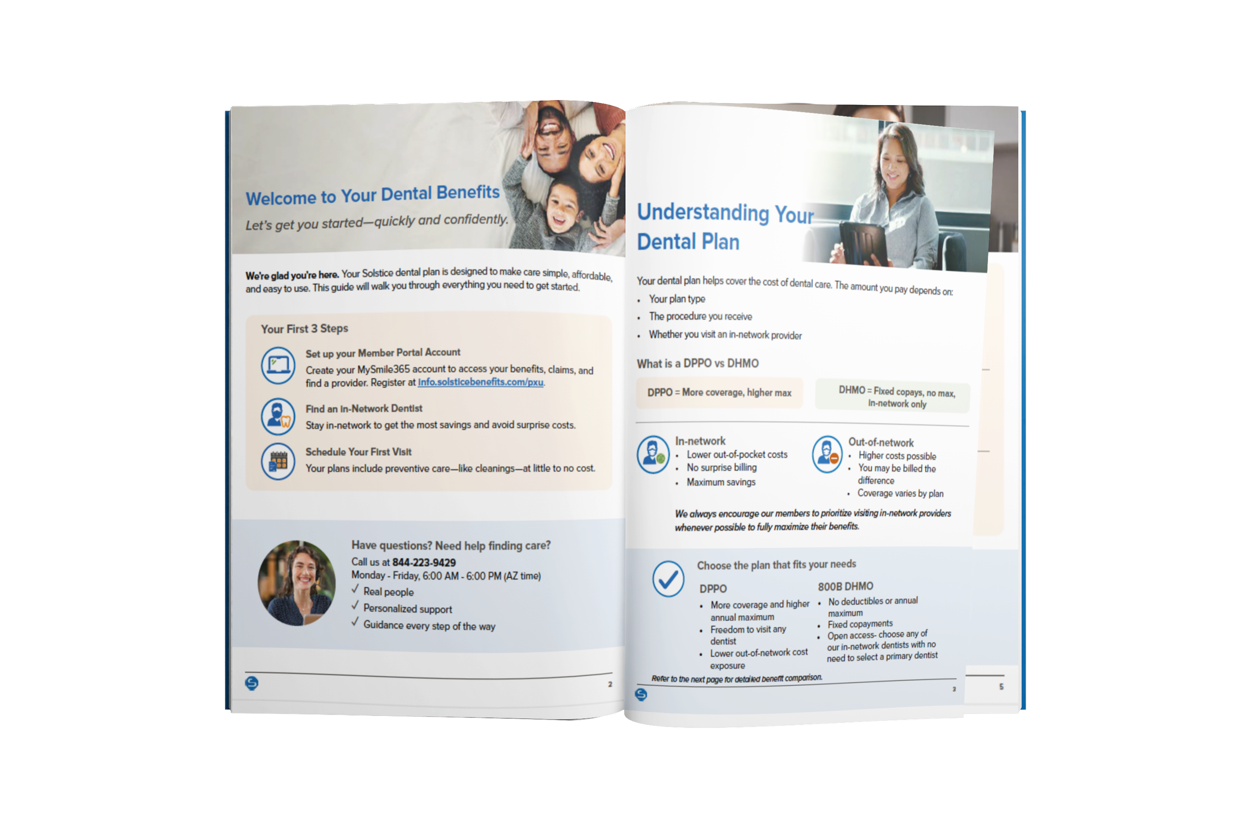
Phoenix Union Member Resource Site and Educational Pieces (Enrollment booklet, comparisons, etc.)

Broker, Member, HR Focused Paid Social



Member Explainer Video on The Differences Between DHMO vs. DPPO
Broker Paid Social and Advertisement Spot “Things We Wish Came With Benefits”

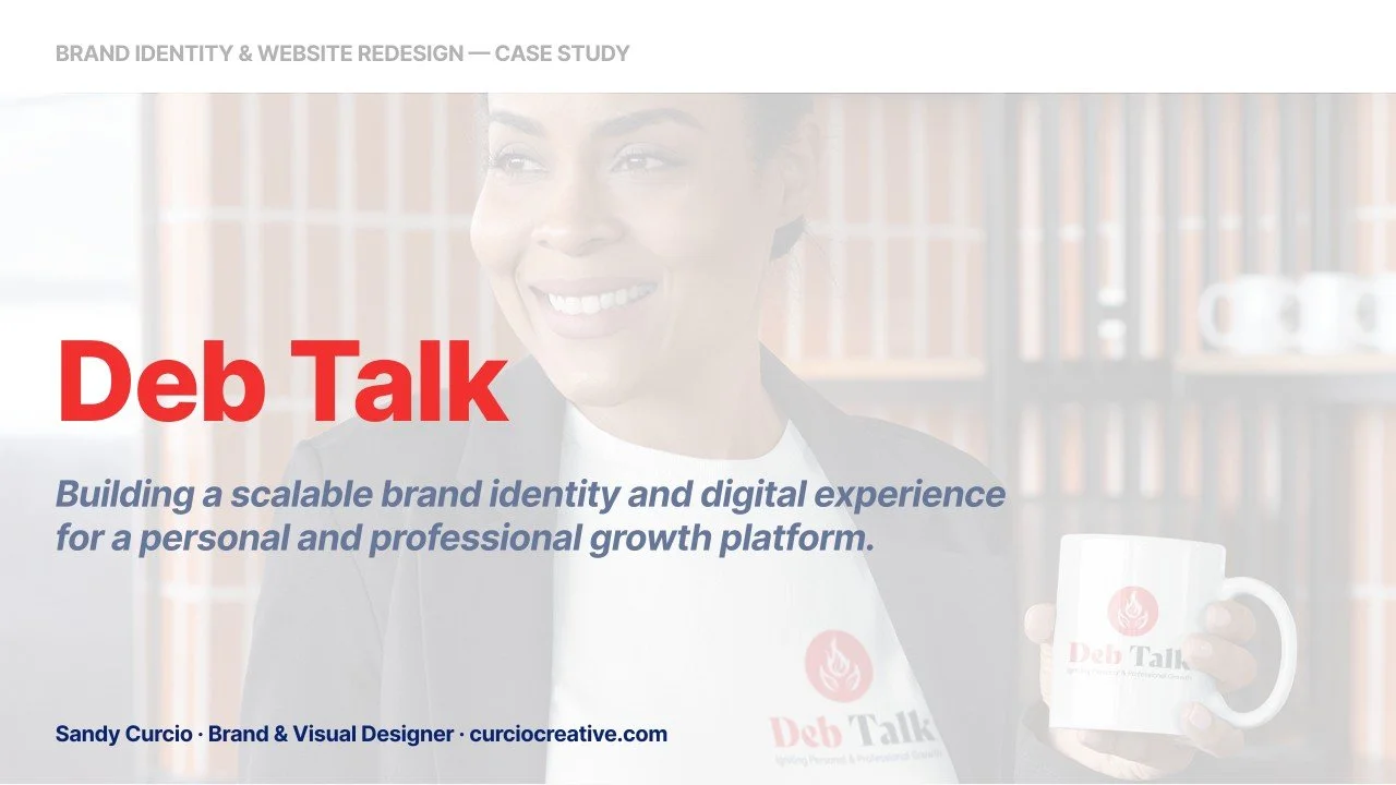
DebTalk Case Study
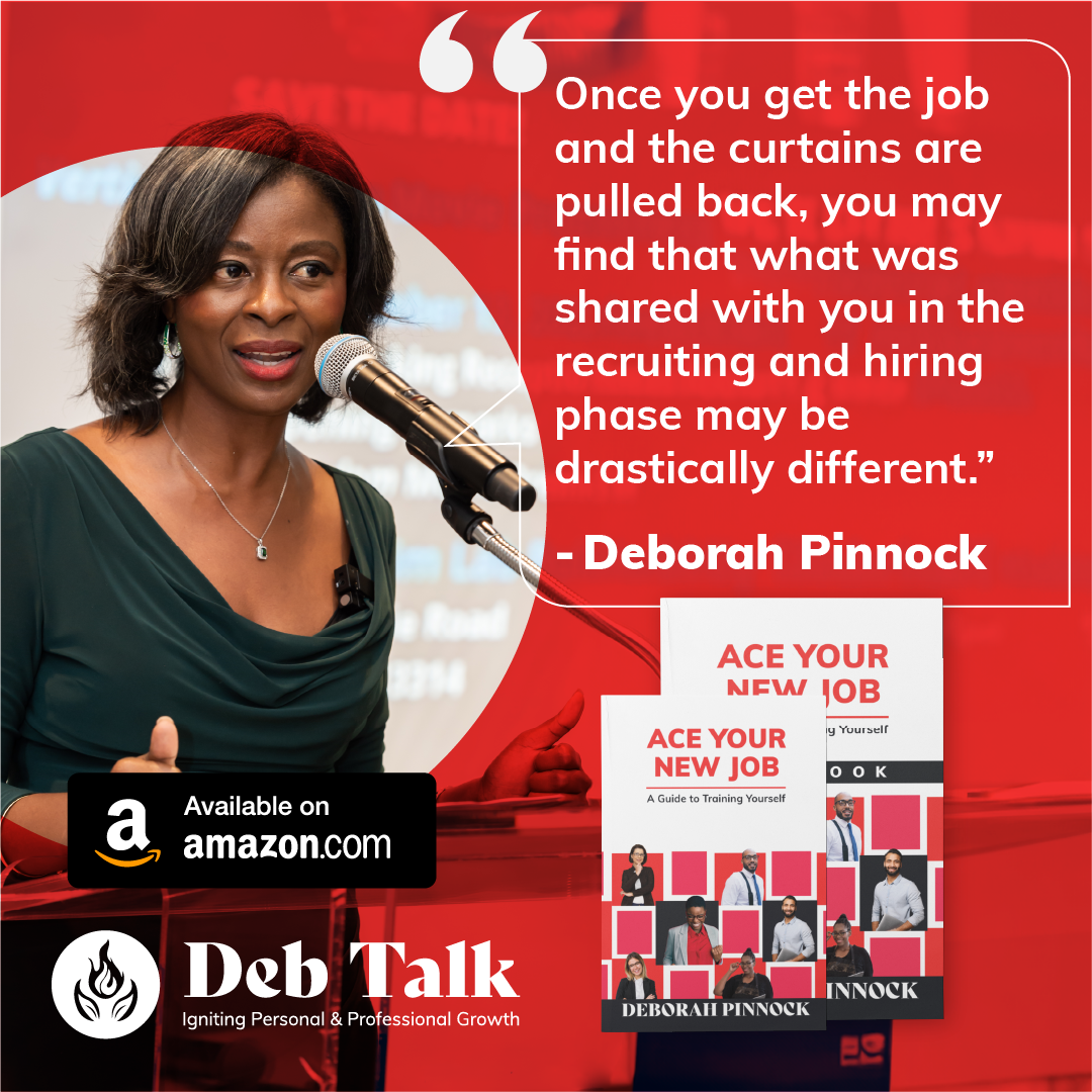
Over the course of four years, I played a central creative role in shaping and evolving the DebTalk brand, beginning with a complete brand identity and website redesign. What started as a single project quickly expanded into an ongoing creative partnership spanning nearly every aspect of the brand experience.
My responsibilities included brand development, web design, book and workbook layout, merchandise design, digital marketing assets, video editing, and promotional campaign creation. Together, these projects formed a cohesive visual ecosystem designed to support personal and professional growth through engaging, purpose-driven storytelling.
One founder, one flame, and every touchpoint in between.
Overview:
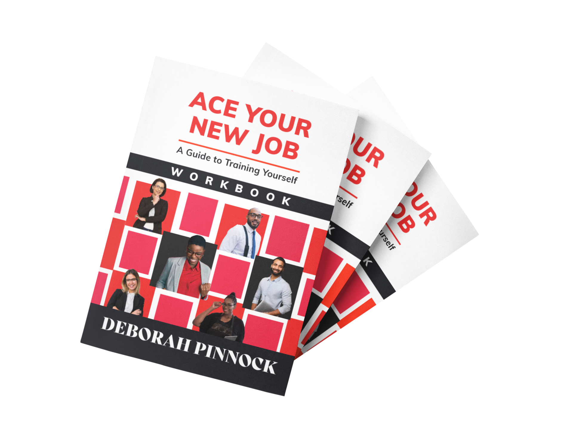
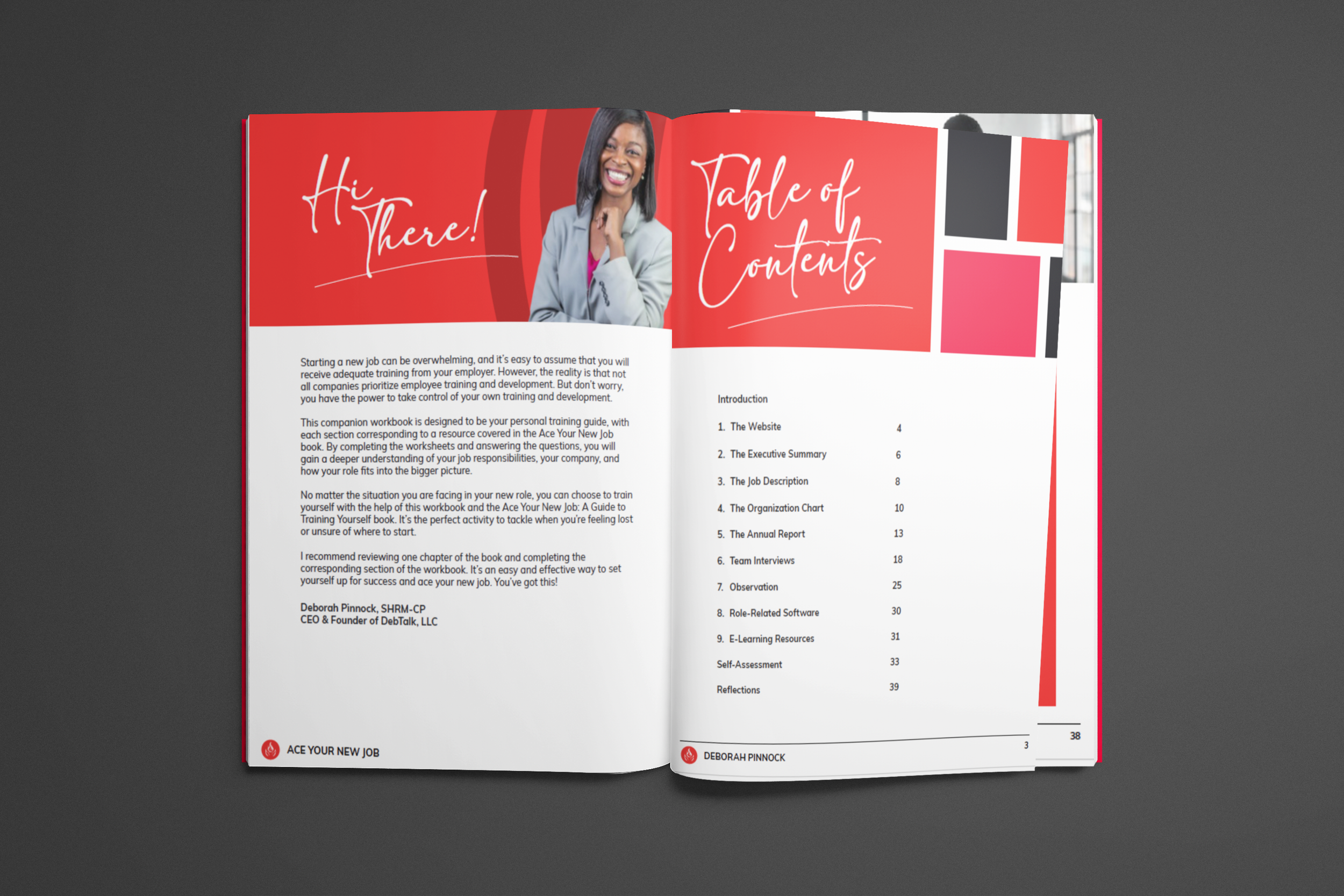
DebTalk hired me in 2021 for a brand identity and website. It turned into a long-term creative partnership covering nearly everything the brand puts into the world: a published book and workbook, workshops, merchandise, campaigns, email, and event signage.
Snapshot
Client: DebTalk, Deborah Pinnock, CEO | Role: Brand designer and ongoing creative partner | Years: 2021 to present | Scope: brand identity, brand guide, website, book and workbook layout, merchandise, social and paid campaigns, email, event signage, presentations, video editing
The Challenge
DebTalk is a personal and professional development brand built around one founder's voice. Deborah needed an identity as warm and direct as she is in a room, and one that could stretch from a website to a book to a hoodie without losing itself.
The Approach
Identity first. Built the logo, palette, and type system, then documented it in a brand guide so every piece that followed had rules to follow.
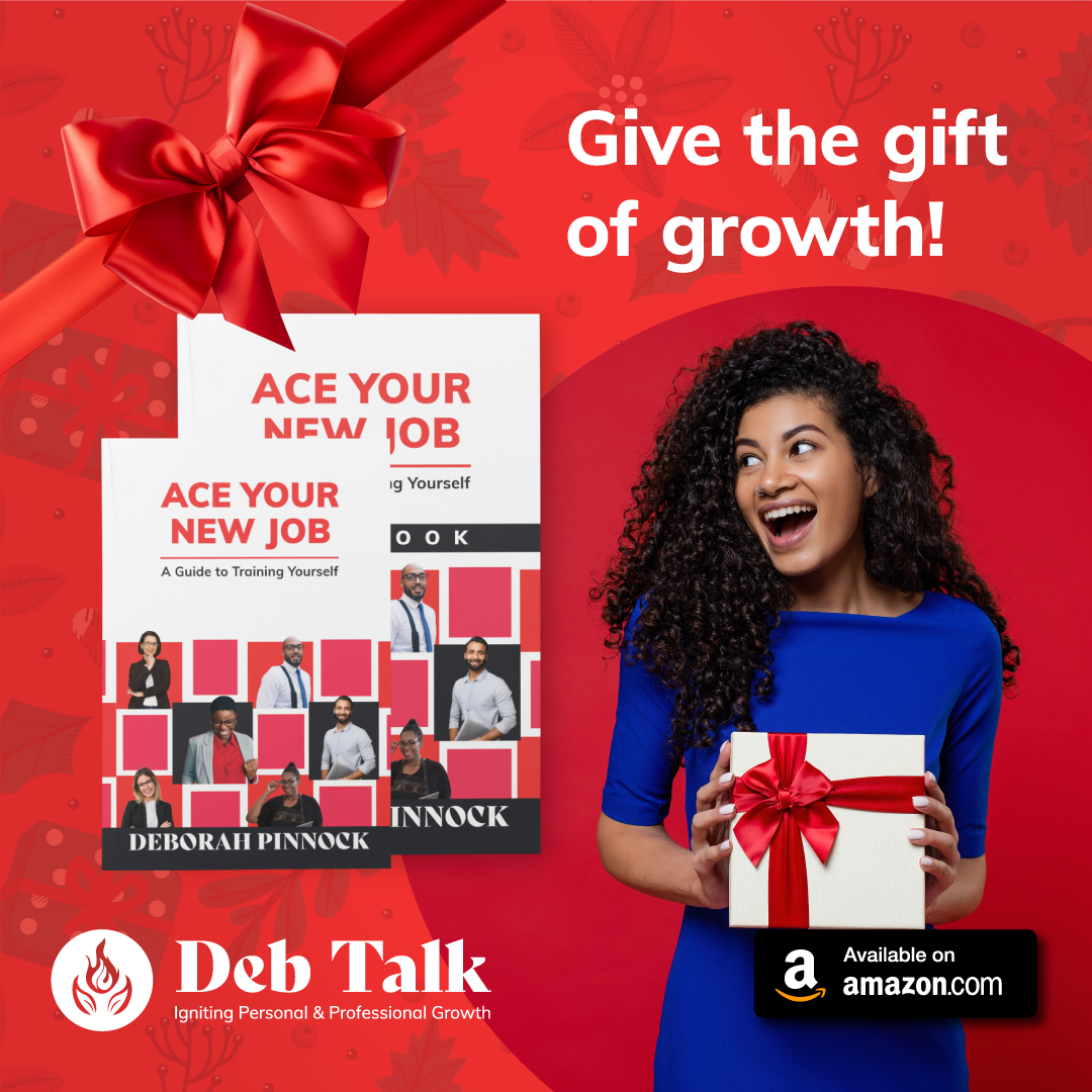
A book launch, start to finish. Formatted the Ace Your New Job manuscript and companion workbook, then ran the launch campaign across social, email, and an animated event invitation.
Workshops and live events. Designed the Seasons of Growth workshop campaign, event signage, flyers, and presentation decks that keep in person moments on brand.
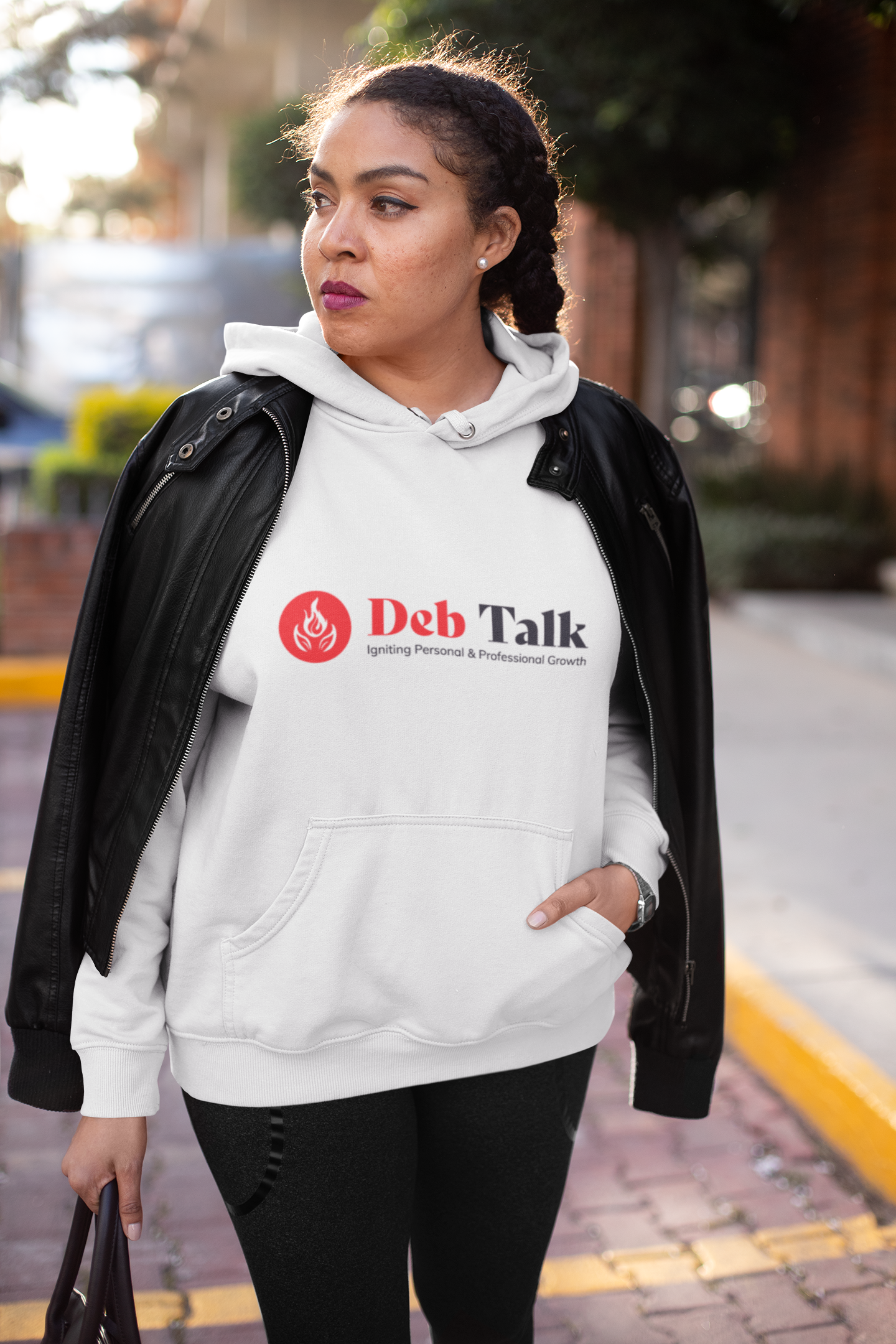
Merch built to sell. Designed the I Am Someone's Daughter line and set up the Printify store behind it.
The Results:
A published book and workbook, a merchandise line, a recurring workshop series, and one identity holding all of it together.
Curated Work
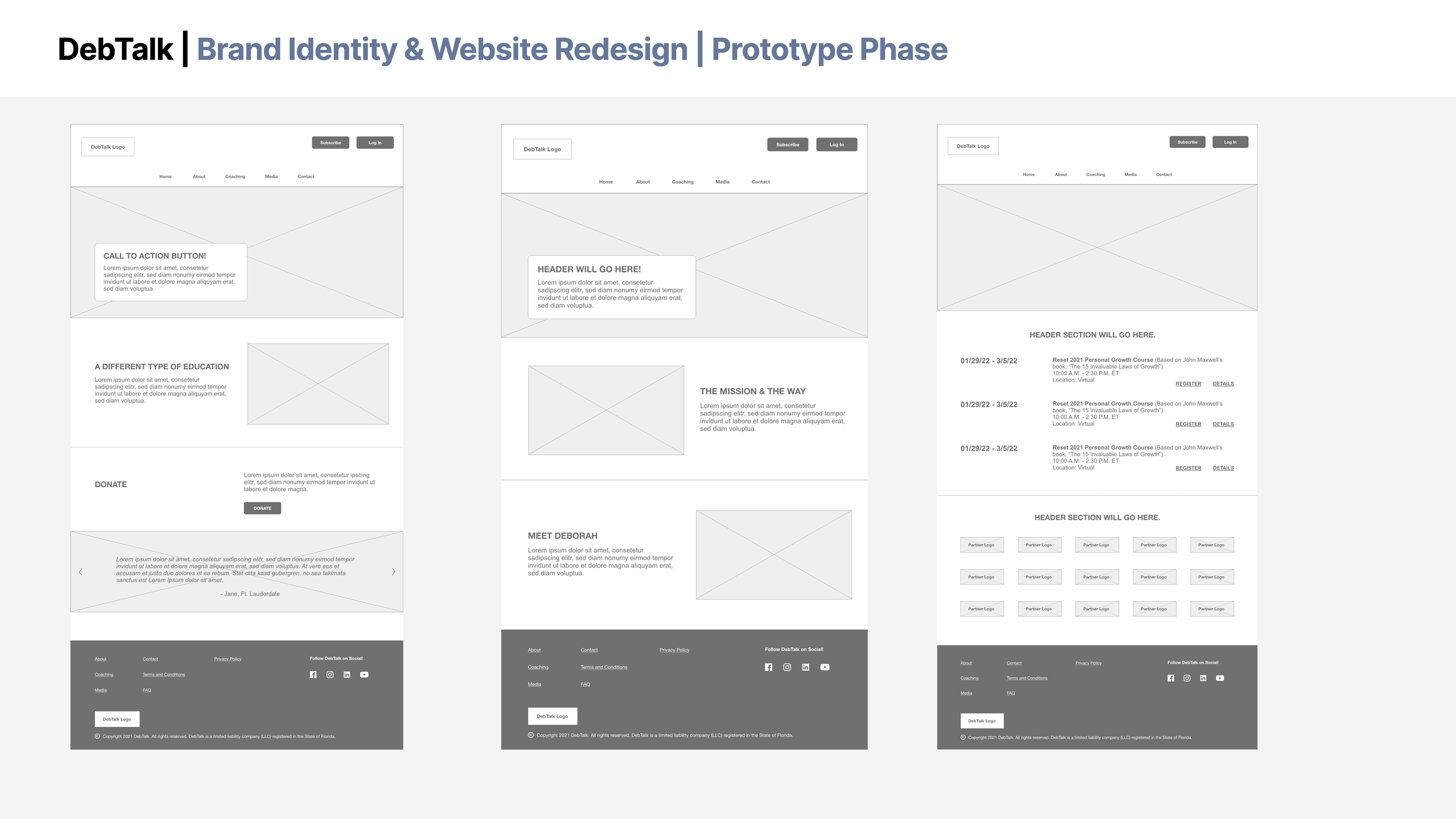
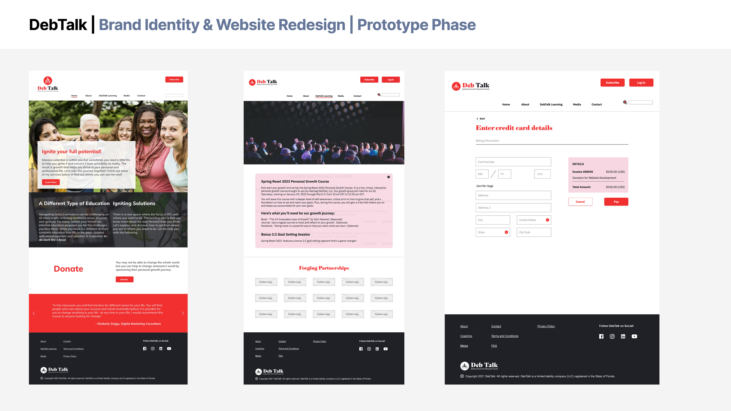



Queen D’s Kitchen Case Study
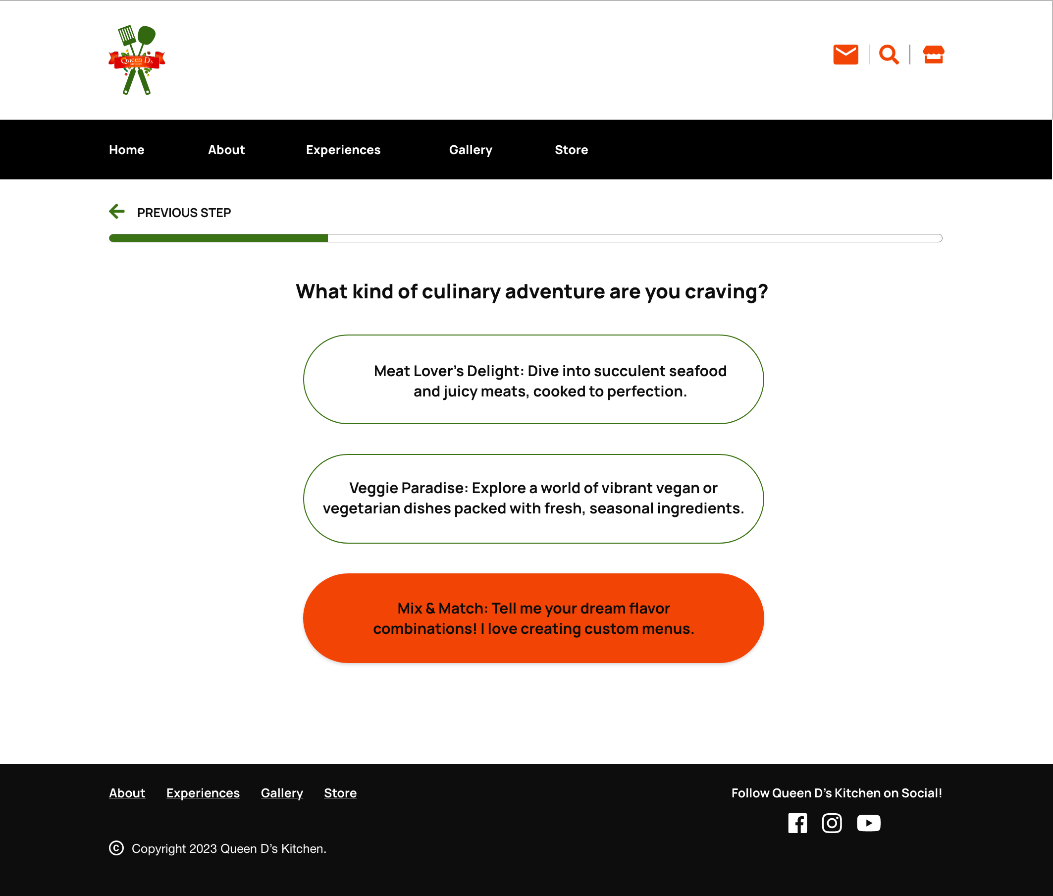
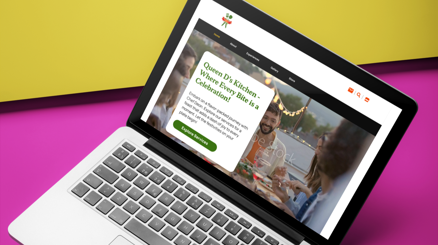
As the lead designer for the Queen D’s Kitchen website redesign, I guided the project from concept development through final implementation. Using Adobe XD, Illustrator, Photoshop, and Adobe Firefly, I developed user flows, custom graphics, visual assets, and a refreshed digital experience designed to better reflect the brand’s personality and community-driven mission.
The final website was developed within the Wix CMS, creating a flexible and engaging platform that highlights recipes, products, catering services, and culinary storytelling through intuitive navigation and bold visual design.
A UX rebuild that made a small business look like it had a much bigger budget.
Overview:
I led the Queen D's Kitchen website redesign from first user flow to final Wix build, along with the product labels and merchandise that carry the brand off screen.
Snapshot
Client: Queen D's Kitchen | Role: Lead designer, concept through launch | Year: 2024 | Tools: Adobe XD, Illustrator, Photoshop, Adobe Firefly, Wix | Scope: UX/UI, web design, booking flows, product labels, merchandise
The Challenge
Queen D's Kitchen runs three businesses under one name: packaged products, catering, and personal chef services. The site had to sell all three without making visitors guess where to click, and it had to look as good as the food.
The Approach
Map it before you paint it. Built user flows for three paths (shop, book catering, hire a personal chef) and an intro page that routes people to the right one.
Booking that asks the right questions. Designed guided, step-by-step request forms for catering and personal chef services, covering event details, menu choices, and beverage preferences, so inquiries arrive complete instead of starting a long email thread.
Product pages that answer questions. Added ingredient and nutrition details right on the product page, where shoppers actually look for them.
The brand beyond the screen. Designed product labels with QR codes that lead back to the site, plus branded tees.
Built to be managed. Developed the final site in Wix so the client can update recipes, products, and services day to day.
The Results:
Launched April 1, 2024. Customers described the new site as professional and polished, and said it made the services feel more high-end than they expected. In other words, the website started doing some of the selling.